Ace Industries
Ace Industries, Inc., founded in 1932, is one of the largest independent overhead crane and hoist distribution, manufacturing, and service companies in the United States. Ace has fully stocked warehouses, service centers, and sales offices located throughout the United States. Ace supports over 100 hoist & crane brands and each of our 300 strong service, sales, and operations associates have an unflappable determination to serve our customers faithfully and knowledgeably. Our CEO Josh Arwood, served as President of the CMAA from 2019-2020. Crane Manufacturer's Association of America.
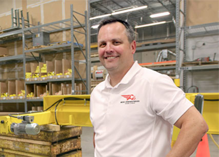
Ace Chief Executive Officer Josh Arwood
Our History
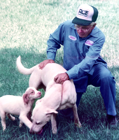
Founder Harold Arwood
Ace’s Foundation
Founded in 1932 as an electric motor shop in Atlanta, GA, Ace started making a name for itself as a customer-focused and forward-thinking organization. During the 1970s and 1980s, Ace became a Master Dealer for Columbus McKinnon Corp., and started stocking products manufactured by CM, Coffing, Lift-Tech, and Yale. At this time, we began focusing on distributing material handling products. As the need emerged and our customers requested, we started manufacturing bridge cranes and runways.
Ace opened its first service manufacturing facility in 1983 and first service branch in 1996 and we haven't stopped since. Certified Crane Care was acquired in 2007 to complement our brand in Alabama. In 2012, we purchased Gaffey Cranes from Columbus McKinnon to enter the explosion-proof market. Henohl Crane’s acquisition in Phoenix, AZ helped us enter the market on the West Coast in 2017.
Now, through three generations of Arwood family ownership, we have upwards of thirty service branches coast to coast, and two manufacturing and distribution facilities. We attribute our growing success to prioritizing quality, customer-first service, always with the goal of serving with integrity to find the right product for the right application.
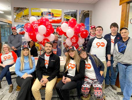
Cheers to 90 Years!
In November of 2022, Ace Industries was happy to celebrate 90 years of service to the overhead crane industry and as many years putting customers first! The secret of our longevity is that we always listen to our customers. Responding to customer requests and feedback is what has shaped the path of Ace in the past, in the present and will be our model into our next 90 years! Thank you to our loyal customers and our incredible employees for making it all possible, and cheers to 90 wonderful years!
Ace Historical Timeline
This timeline reel highlights key milestones that tell the story of Ace history from 1932 to present day. From our origins as a small machine shop in downtown Atlanta, GA, to the acquisition of material lifting manufacturing capabilities, the sale of crane and hoist parts and accessories to providing qualified crane service nationwide. We hope that you'll become part of our journey!
Our Brand
Ace Industries Rebranding Event Video, November, 2019
After honoring our long history and heritage from 1932-2018, the timing was ideal to move forward with a fresh new look and strong value messaging. In fall of 2019, Ace Industries unveiled its new logo, tagline and messaging, which are intended to more clearly represent the company’s position of authority in the industry, its tenacity to get things done, and its dependability while providing comprehensive offerings and value to our customers.
With all our exciting growth and new initiatives, we needed a brand that was more progressive than our well-loved wordmark, created in the 1970's.
The new branding conveys the company's heightened focus on the customer, while embracing Ace's heritage by retaining its familiar red and black colors, updated to a more energetic orange/red hue and an array of both warm and cool, confident grays.
The new brand design comprises the "A" of Ace configured within the symbol of a dynamic eagle in mid-striking position and the wordmark "Ace Industries" in a strong, forward moving italic font.
The company added the tagline "The Sky's The Limit" to further reinforce its message that we are capable of anything that might be called upon us by our customer and there are no limits to the extent we will go to serve.
We believe our efforts to transform Ace while still embracing our formidable heritage, will keep our brand relevant for generations to come.
Our Symbol, the Eagle
Eagle conveys the powers and messages of the spirit; it is man’s connection to the divine because it flies higher than any other bird. If eagle has appeared, it bestows freedom and courage to look ahead. The eagle is symbolic of the importance of honesty and truthful principles.
When an eagle appears, you are on notice to be courageous and stretch your limits. Do not accept the status quo, but rather reach higher and become more than you believe you are capable of. Look at things from a new, higher perspective.
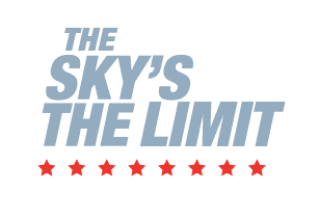
Our Tagline, The Sky’s the Limit
At Ace Industries, as our tagline indicates, we belie ve there are no limits and anything is possible. You can achieve anything if you really want to. There is nothing that can prevent you from reaching success. Dream big, fly high.
Ace Industries logos over the years.
The Ace Creed
Ace Industries Creed Video from our Brand Release Event, November, 2019
The Fire is Burning. We're Driven to Win, and We Have Pride in the Work We Do.
We believe in ourselves.
We have the kind of confidence that comes from years upon years of experience.
We do things because they’re right.
Honesty is fundamental to our core.
We earn everything we get.
We roll up our sleeves, all of us.
We take care of ours.
People build lifelong careers here.
Families are made here.
Ask for us by name.
We help each other succeed.
It’s how we measure success.
Everyone gives their best,
knowing others are counting on them.
We work together as one.
Everyone has the most important role in the company.
We learn from others.
We know that our strength lies in our differences.
We are inclusive and celebrate diversity.
We dont't stop when we're tired,
we stop when we're done.
You won't outwork us.
We gain momentum every day.
We are a machine in motion,
You can’t stop us.
We care about what we do.
It’s seen in our product as well as our people.
We respect and honor our history by making our own.
Our longevity is no accident.
Ace Values
We believe in Each Other.
We Believe in Doing Things Right.
We Believe in Change.
We’re Never Satisfied.
We Believe in Going the Extra Mile.
We Believe in Family. It’s Why we Work Every Day.
ACE'S Mission Statement
Our Mission is to Build Great Lifting Equipment, Foster Innovation that Improves our Industry and Provide a Place Where People are Valued and Can Grow.
ACE's Vision Statement
It is Our Vision to Lead the Overhead Lifting Industry with the Best People, the Highest Performing Products and the Happiest Customers.
ACE's Brand Promise
We Stand Behind Our People and Our Products.
Media

MHI Cast podcast
Ace CEO Josh Arwood, then president of the CMAA on MHI Cast, MHI's material handling industry talk show podcast. Josh interviews with Jerry Eischens, president of MMA and Mark Arthur, president of MHI. They discuss the benefits of overhead material handling and what to consider when deciding which equipment to choose.

Hoist Magazine video interview
Ace COO Daniel Arwood in conversation with Jenny Eagle, Editor of Hoist Magazine, about working with NASA, working alongside siblings in a family-owned business and what's in the future for Ace Industries.

Hoist Magazine publication
The July 2021 issue of Hoist Magazine features an article on Ace’s Pelham modernization team. Read about their awe inspiring project, installing new heavy duty cranes on the intake valves of a dam used for hydropower.

Manufacturing in Focus Magazine publication
In a six page article, the October 2021 issue of Manufacturing In Focus Magazine chronicles Ace's humble beginnings as “Ace Motor Repair” in 1932 and our expansion of offerings, capabilities and locations through three generations into the largest independently owned crane and hoist company in the US.

Hoist Magazine publication
The November 2021 issue of Hoist Magazine features Ace on the cover and highlights our work installing cranes for proton therapy cancer treatment centers around the country.

Hoist Magazine publication
The March 2022 International Women's Day issue of Hoist Magazine celebrates Ace accomplished staff Engineering Manager Molly Wood as she leads the way for the next generation of women in the crane industry.

Hoist Magazine publication
The July 2022 issue of Hoist Magazine chronicles the Ace Portand, OR branch's uncanny solution to a flawed steel process crane design.